플렉스 박스 레이아웃의 패딩-하단 / 상단
두 항목이 포함 된 flexbox 레이아웃 이 있습니다. 그중 하나는 padding-bottom을 사용합니다 .
#flexBox {
  border: 1px solid red;
  width: 50%;
  margin: 0 auto;
  padding: 1em;
  display: flex;
  flex-direction: column;
}
#text {
  border: 1px solid green;
  padding: .5em;
}
#padding {
  margin: 1em 0;
  border: 1px solid blue;
  padding-bottom: 56.25%; /* intrinsic aspect ratio */
  height: 0;
}
<div id='flexBox'>
<div id='padding'></div>
<div id='text'>Some text</div>
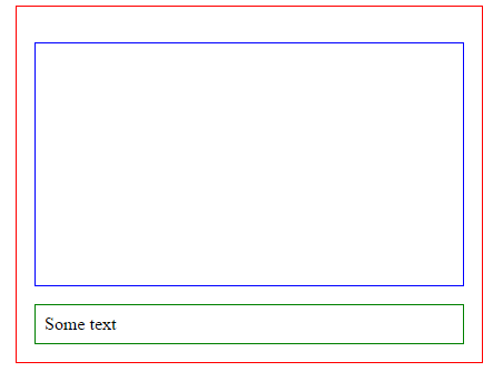
</div>파란색 요소 는 페이지 크기가 조정될 때 너비에 따라 종횡비를 유지합니다 . 이것은 Chrome 및 IE에서 작동 하며 다음과 같습니다.
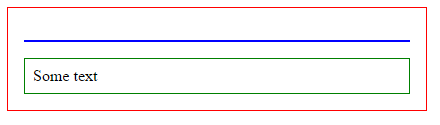
그러나 Firefox 및 Edge 에서는 다음과 같은 결과가 나타납니다 (종횡비를 유지하는 파란색 상자의 패딩을 무시 함).
나는 이것이 작동 해야하는지 또는 작동하지 않아야하는지 정말로 이해하기에는 flexbox에 너무 익숙합니다. flexbox의 요점은 크기를 조정하는 것이지만, 왜 이것이 내장 패딩을 무시하고 파란색 요소에 절대 크기를 두는지 잘 모르겠습니다.
궁극적으로 Firefox 또는 Chrome이 올바른 작업을 수행하는지 확실하지 않은 것 같습니다! Firefox Flexbox 전문가가 도움을 줄 수 있습니까?
2018 년 2 월 업데이트
Firefox와 Edge는 플렉스 (및 그리드) 항목에 대한 상단, 하단 여백 및 패딩의 동작을 변경하는 데 동의했습니다.
[...] 예를 들어 왼쪽 / 오른쪽 / 위 / 아래 백분율은 모두 가로 쓰기 모드에서 컨테이너 블록의 너비에 대해 해결됩니다. [ 출처 ]
이것은 아직 구현되지 않았습니다 (FF 58.0.2에서 테스트 됨).
2016 년 4 월 업데이트
( 2017 년 5 월 유효 )
사양이 다음 으로 업데이트 되었습니다.
플렉스 항목의 여백 및 패딩 백분율은 다음 중 하나에 대해 해결할 수 있습니다.
- 자신의 축 (왼쪽 / 오른쪽 백분율은 너비에 대해 확인, 위쪽 / 아래쪽은 높이에 대해 확인) 또는
- 인라인 축 (왼쪽 / 오른쪽 / 상단 / 하단 백분율은 모두 너비에 대해 해결됨)
출처 : CSS Flexible Box 레이아웃 모듈 레벨 1
즉, chrome IE FF 및 Edge (동일한 동작이 아니더라도) 사양 권장 사항을 따릅니다.
사양은 또한 다음과 같이 말합니다.
작성자는 플렉스 항목의 패딩이나 여백에 백분율을 사용하지 않아야합니다. 브라우저마다 다른 동작이 발생하기 때문입니다. [ 출처 ]
해결 방법 :
플렉스 컨테이너의 첫 번째 자식을 다른 요소에 래핑하고 두 번째 자식에 넣을 수 있습니다 padding-bottom.
#flexBox {
  border: 1px solid red;
  width: 50%;
  margin: 0 auto;
  padding: 1em;
  display: flex;
  flex-direction: column;
}
#text {
  border: 1px solid green;
  padding: .5em;
}
#padding {
  margin: 1em 0;
  border: 1px solid blue;
}
#padding > div {
  padding-bottom: 56.25%; /* intrinsic aspect ratio */
}
<div id='flexBox'>
<div id='padding'><div></div></div>
<div id='text'>Some text</div>
</div>I tested this in modern browsers (IE, chrome, FF and Edge) and they all have the same behaviour. As the configuration of the 2nd child is the "same as usual", I suppose that older browsers (that aslo support flexbox layout module) will render the same layout.
Previous answer:
According to the specs, Firefox has the right behaviour
Explanantion :
Unlike block items which calculate their % margin/padding according to the containers width, on flex items:
Percentage margins and paddings on flex items are always resolved against their respective dimensions; unlike blocks, they do not always resolve against the inline dimension of their containing block.
This means that padding-bottom/top and margin-bottom/top are calculated according to the height of the container and not the width like in non-flexbox layouts.
As you have not specified any height on the parent flex item, the bottom padding of the child is supposed to be 0px.
Here is a fiddle with a fixed height on the parent that shows that padding bottom is calculated according to the height of the display:flex; container.
The accepted answer is correct but I improved on the solution by using a pseudo-element instead of adding a new element in to the HTML.
Example: http://jsfiddle.net/4q5c4ept/
HTML:
<div id='mainFlexbox'>
  <div id='videoPlaceholder'>
    <iframe id='catsVideo' src="//www.youtube.com/embed/tntOCGkgt98?showinfo=0" frameborder="0" allowfullscreen></iframe>
  </div>
  <div id='pnlText'>That's cool! This text is underneath the video in the HTML but above the video because of 'column-reverse' flex-direction.    </div>
</div>
CSS:
#mainFlexbox {
  border: 1px solid red;
  width: 50%;
  margin: 0 auto;
  padding: 1em;
  display: flex;
  flex-direction: column-reverse;
}
#pnlText {
  border: 1px solid green;
  padding: .5em;
}
#videoPlaceholder {
  position: relative;
  margin: 1em 0;
  border: 1px solid blue;
}
#videoPlaceholder::after {
  content: '';
  display: block;
  /* intrinsic aspect ratio */
  padding-bottom: 56.25%;
  height: 0;
}
#catsVideo {
  position: absolute;
  top: 0;
  left: 0;
  width: 100%;
  height: 100%;
}
I used vh instead of % worked perfectly in Safari, Firefox & Edge
    <div class="flex-parent">
      <div class="flexchild">
        <div class="pad"></div>
      </div>
    </div>

.flex-child{
   height:100%;
}
.padd{
   padding-top:100% /* write 100%, or instead your value*/;
}
참고 URL : https://stackoverflow.com/questions/23717953/padding-bottom-top-in-flexbox-layout
'code' 카테고리의 다른 글
| Tomcat 메모리 설정 늘리기 (0) | 2020.10.24 |
|---|---|
| Json.NET을 사용하여 모든 유형의 객체를 JObject로 변환 (0) | 2020.10.24 |
| PostgreSQL CASE… 여러 조건으로 종료 (0) | 2020.10.24 |
| C #에서 Word 문서를 어떻게 만들 수 있습니까? (0) | 2020.10.24 |
| KDIFF 병합에서 A, B 및 C는 무엇입니까? (0) | 2020.10.24 |