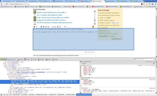
텍스트 영역이 부모 DIV 요소를 넘어 확장되는 것을 어떻게 방지 할 수 있습니까? (google-chrome 문제 만 해당)
텍스트 영역이 부모 DIV 요소를 넘어서 늘어나는 것을 어떻게 방지 할 수 있습니까?
DIV 내부에있는 테이블 안에이 텍스트 영역이 있고 전체 테이블이 범위를 벗어나는 것처럼 보입니다.
더 간단한 경우에도 동일한 상황의 예를 볼 수 있습니다. div 안에 텍스트 영역을 추가하기 만하면됩니다 (예 : www.stackoverflow.com에서 사용됨).
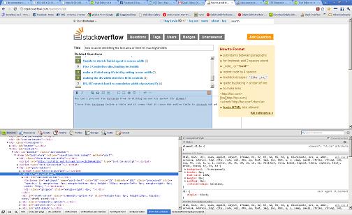
아래 이미지에서 텍스트 영역이 부모 크기 이상으로 늘어날 수 있음을 알 수 있습니까? 이것을 어떻게 방지합니까?
저는 CSS에 익숙하지 않아서 어떤 CSS 속성을 사용해야하는지 잘 모르겠습니다. 나는 디스플레이 와 같은 몇 가지를 시도 하고 오버플로 . 그러나 그들은 속임수를 쓰지 않는 것 같습니다. 내가 놓친 다른 것이 있습니까?
UPDATE: HTML
CSS
textarea {
max-width: 50%;
}
#container {
width: 80%;
border: 1px solid red;
}
#cont2{
width: 60%;
border: 1px solid blue;
}
If you put this code inside the http://jsfiddle.net, you will see that they act differently. Although the textarea is limited to the percentage declared in its css style, it is still possible to get it to cause its parent table to be as large as it wants to be, and then you can see that it spills over its parent border. Any thoughts on how to fix this?
To disable resizing completely:
textarea {
    resize: none;
}
To allow only vertical resizing:
textarea {
    resize: vertical;
}
To allow only horizontal resizing:
textarea {
    resize: horizontal;
}
Or you can limit size:
textarea {
    max-width: 100px;
    max-height: 100px;
}
To limit size to parents width and/or height:
textarea {
    max-width: 100%;
    max-height: 100%;
}
Textarea resize control is available via the CSS3 resize property:
textarea { resize: both; } /* none|horizontal|vertical|both */
textarea.resize-vertical{ resize: vertical; }
textarea.resize-none { resize: none; }
Allowable values self-explanatory: none (disables textarea resizing), both, vertical and horizontal.
Notice that in Chrome, Firefox and Safari the default is both.
If you want to constrain the width and height of the textarea element, that's not a problem: these browsers also respect max-height, max-width, min-height, and min-width CSS properties to provide resizing within certain proportions.
Code example:
#textarea-wrapper {
  padding: 10px;
  background-color: #f4f4f4;
  width: 300px;
}

#textarea-wrapper textarea {
  min-height:50px;
  max-height:120px;
  width: 290px;
}

#textarea-wrapper textarea.vertical {
  resize: vertical;
}
<div id="textarea-wrapper">
<label for="resize-default">Textarea (default):</label>
<textarea name="resize-default" id="resize-default"></textarea>
<label for="resize-vertical">Textarea (vertical):</label>
<textarea name="resize-vertical" id="resize-vertical" class="vertical">Notice this allows only vertical resize!</textarea>
</div>I'm hoping you are having the same problem that I had... my issue was simple: Make a fixed textarea with locked percentages inside the container (I'm new to CSS/JS/HTML, so bear with me, if I don't get the lingo correct) so that no matter the device it's displaying on, the box filling the container (the table cell) takes up the correct amount of space. Here's how I solved it:
<table width=100%>
    <tr class="idbbs">
        B.S.:
    </tr></br>
    <tr>
        <textarea id="bsinpt"></textarea>
    </tr>
</table>
Then CSS Looks like this...
#bsinpt
{
    color: gainsboro;
    float: none;
    background: black;
    text-align: left;
    font-family: "Helvetica", "Tahoma", "Verdana", "Arial Black", sans-serif;
    font-size: 100%;
  position: absolute;
  min-height: 60%;
  min-width: 88%;
  max-height: 60%;
  max-width: 88%;
  resize: none;
    border-top-color: lightsteelblue;
    border-top-width: 1px;
    border-left-color: lightsteelblue;
    border-left-width: 1px;
    border-right-color: lightsteelblue;
    border-right-width: 1px;
    border-bottom-color: lightsteelblue;
    border-bottom-width: 1px;
}
Sorry for the sloppy code block here, but I had to show you what's important and I don't know how to insert quoted CSS code on this website. In any case, to ensure you see what I'm talking about, the important CSS is less indented here...
What I then did (as shown here) is very specifically tweak the percentages until I found the ones that worked perfectly to fit display, no matter what device screen is used.
Granted, I think the "resize: none;" is overkill, but better safe than sorry and now the consumers will not have anyway to resize the box, nor will it matter what device they are viewing it from.
It works great.
textarea {
width: 700px;
height: 100px;
resize: none; }
assign your required width and height for the textarea and then use. resize: none ; css property which will disable the textarea's stretchable property.
'code' 카테고리의 다른 글
| Android ClassNotFoundException : 경로에서 클래스를 찾지 못했습니다. (0) | 2020.08.30 |
|---|---|
| 한 필드의 개수가 1보다 큰 경우 선택 (0) | 2020.08.30 |
| Xcode 4에서 명령 줄 인수를 어떻게 지정합니까? (0) | 2020.08.30 |
| 소스가 git에서 감지되었지만 등록되지 않은 Vcs 루트가 감지되도록 IntelliJ IDEA를 구성하십시오. (0) | 2020.08.30 |
| 내 열 (SQL Server 2008 R2)에 고유 한 제약 조건을 만들려면 어떻게해야합니까? (0) | 2020.08.30 |